On Printed Writs
–article by Magister Gunðormr Dengir & Duchess Thyra Eiriksdottir
A writ is “a form of written command in the name of a legal authority”. In the SCA, we specifically use writs to “command” someone to appear at a later court, exclusively to be elevated to a peerage (1). There are many reasons why a writ would be given (2), but the format of writs is not defined in EK Law. Over the years, writs have become more commonly used, which is generally considered to be a good thing – except that it doubles the numbers for peerage-related scribal assignments, which are already time-consuming.
Baroness Feilinn, Tyger Clerk of the Signet, was asked to comment about why standardized writs were introduced this year. “Because that writ scope-creep was [beep beeeep].” Writs have been as short as 8 characters (3), and have been as elaborate as full gilded scrolls. Most have been calligraphy-only documents, which still require several hours of work to complete.
A sensible solution today, as in the medieval period, is moveable-type printing. After getting the enthusiastic assent of the Signet, we set to planning and producing hand-printed writs, the first of which were handed out in court this past week.
Although the type used is of modern manufacture, and some of the techniques are more 19th than 16th C, the process for typesetting and printing these writs is the same as it would have been: a text is prepared, type is set in lines, spaced with blanks for spaces and leading for space between the lines, a proof copy is pulled. Once the proof has been corrected, the full run is printed and trimmed to final size, and finally the press is cleaned.
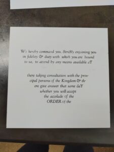
The wording was prepared with the assistance of Mistress Alys Mackyntoich and Don Matthias Grunwald, following the model of a 15th C English Royal summons. Several versions had to be prepared, to allow us to adjust the text block into the proper shape. Once we were at the press, we got to pick a typeface (4). We opted for a 24 point (5) italic Kennerly, a nice swashful (6) type that lent itself to a 16th C style document. We also decided to set the lines of type in a descending triangle, a design that is sometimes seen on title pages and colophons of period printed books.
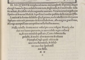
Then came the actual setting of type, line by line, separated by thin sheets of lead. To maintain the triangular form, each line had to be justified – that is, the spacing between words was adjusted so the lines were exactly as long as needed, sometimes ending in a hyphenated word. This was done with varying sizes of blank lead blocks. Toward the end of the typesetting process, we realized that there were not enough lower-case letters “o” in the case to print the text as written, so further edits were made to the text to remove words containing “o”. The number 0 was also employed in some words. Then came proofing, running a single page off of the text to check for errors, correction of the errors, further proofing, &c.

The completed text block was transferred to a galley (a metal plate), and tied tightly with string to keep it safe until the next evening of printing.
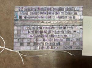
When it came time to print, the block of type was placed in a chase (an iron frame), which was filled out with furniture (wooden blocks), and locked in place with a quoin (a device to shim everything tightly).
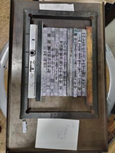
Only then could the locked block of type be placed on the printing press, the rollers inked, and the full block of text proofed, this time checking for the orientation of the paper in relation to the block. Once satisfied with the quality, the printing process began in earnest.
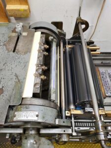
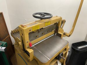
Letterpress ink does not dry like calligraphic ink, where the solvent evaporates and leaves behind the pigment particles on the page. Press ink is rubber-based, and polymerizes on exposure to air. That is one of the reasons to keep the rollers going constantly through the process, to disrupt the formation of a skin on the ink between runs. Finding space to lay out 60 pages to set was one of the unexpected challenges, and we had to employ our dancing skills to move batches around the cramped space. Once all the pages were printed and dry enough to work with, they were stacked and trimmed on a large guillotine paper cutter. Finally the press was thoroughly cleaned and all of the type put back in the case.
The last step will be personalization of the writs. The recipient’s name will be added to the top of the document. The name of the event for the elevation will be added to the middle, or, if unscheduled, will be a standard line stating “at a mutually agreed time and place.” Writs are frequently unsigned (as they are not award scrolls). The printed writs can be used for multiple reigns. (7)
Was the effort worth it? Let’s compare the time it would take to complete 50 writs, by each method.
| Printed | Hand-written |
| 3hrs wordsmithing | 1.5hrs wordsmithing |
| 3hrs typesetting | 1hr material prep/practice |
| 3hrs printing, cutting, cleaning | 2hrs calligraphy (average) |
| 20mins personalization per writ = 16hrs | -> 4.5hrs per writ, x50 |
| = 25 hours total | =225 hours total |
The printing is quicker by a factor of 9, and we expect the writs to last for a couple of years. Look for them at upcoming events!
Footnotes
(1) To be specific: to answer the question whether they will join the peerage. But functionally, all of the regalia has already been prepared prior to that later date, so it is rarely if ever refused.
(2) The recipient may not like big surprises. The recipient may want to be more involved in the decision-making process. The royals may not be able to schedule the elevation during their reign. The recipient may not come to many royal progress events. And many more reasons…
(3) “U OL 1/31?” For the Laureling of Mistress Alys Mackyntoich, the wordsmith of many long scrolls.
(4) In printing, the terms “typeface” and “font” have slightly different meanings than on computers. A printing typeface is the overall family, eg. Courier or Kennerly, and the font is a specific size/weight of that, eg. Kennerly 24pt Italic
(5) A point is a typographic measurement equalling 1/72 of an inch. This measures not the height of the letters, but the height of the blocks of type, all of which need to be equal in height to line up properly.
(6) An actual technical term for typefaces, meaning that some letters extend beyond the size of the block.
(7) Unlike the previous printed writs, which used an etched plate and text personalized to the royals.

One comment
Comments are closed.